
Essential color theory every web designer needs to know
Introduction
Any designer will tell you that choosing colors can be hard — especially for personal projects where there isn’t an existing design system to copy hex codes from. Along with its difficulty, it is also highly important.
Color is one of the first things that users will see and associate your brand with. In a 7-Eleven, you don’t browse the chips section looking for the word ‘Cheetos’, you first look for the bright orange bag.

You should decide on the colors you use with consideration of your design’s purpose and audience.
What do you want your users to think when they view your design? What do you want them to feel? How do you choose the colors you need to capture that emotion?
In this article, I will cover the following:
- the basics of color psychology,
- the elements that make up a color,
- how you can select the color schemes viable for your website’s purpose,
- and what kind of tools you can use to help you to do it.
Why do colors make you feel?
Color is one of those things that has an intrinsic involvement in our lives. Your twelve-year-old self probably had a favorite color — mine was green because I watched too much Ninja Turtles. Ben 10 also influenced my adoration of green a lot. I probably watched too much cartoons. Too much.
Color is a power which directly influences the soul.— Wassily Kandinsky
Every time I think of the color green now, I find myself missing my childhood, recalling all the times I woke up early to watch my favorite cartoon reptiles. Even though that’s what I feel for the color green, it might not be the same for you. Why is that?
The importance of context
Color can represent many different things — emotions, culture, ideologies, etc. We usually build these connections in our heads from prior knowledge and memories. The color green might evoke nostalgia for me, but for you, it might represent something entirely different — the usual associations with green are money, luck, or health.
So it isn’t really black or white (no pun intended). A single color can communicate different messages in different contexts.
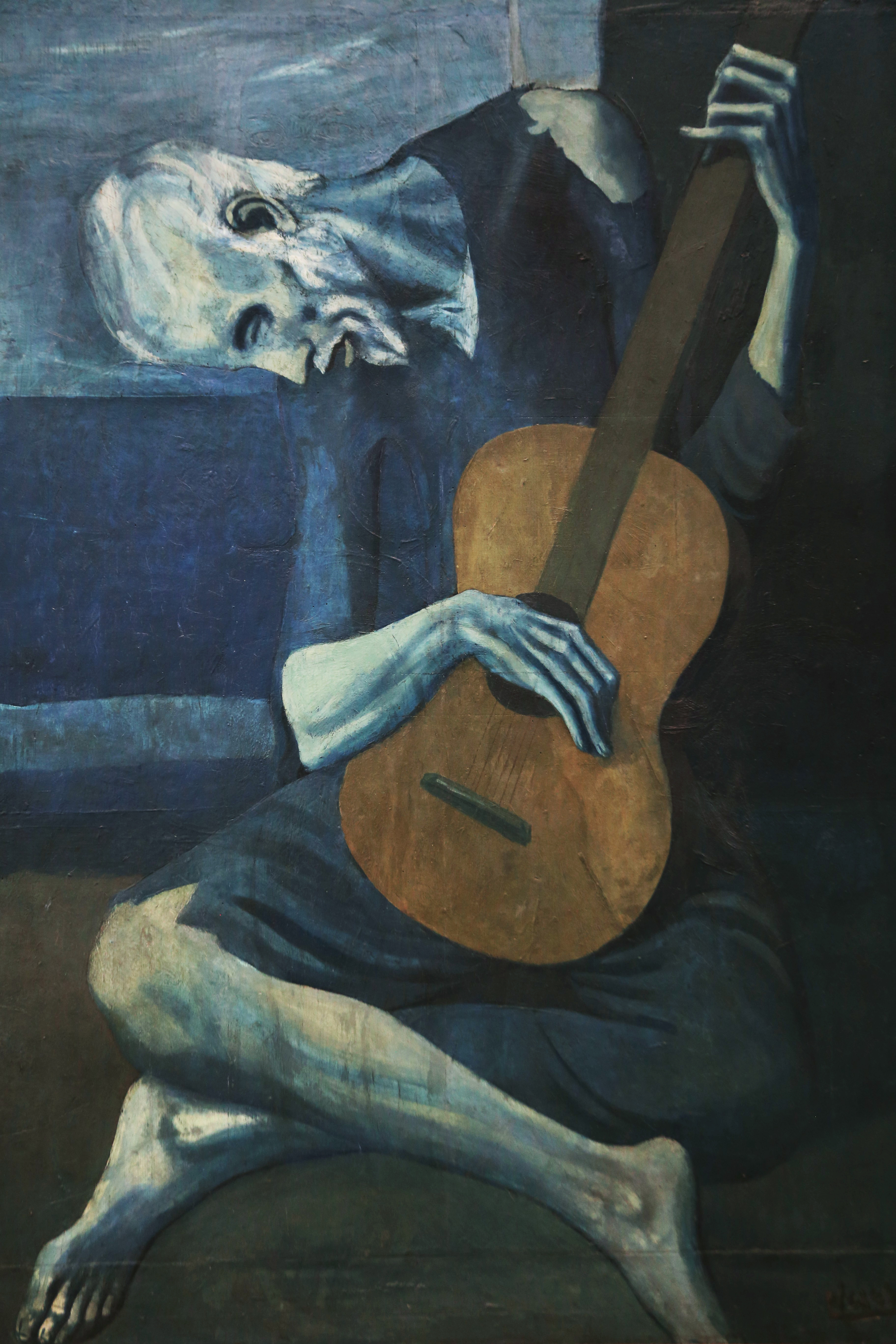
The expression ‘feeling blue’ has been around forever. Pablo Picasso’s famous “Blue Period” consisted of paintings deliberately using different shades of blue to convey his emotions at the time — sadness and melancholy.
But when the internet came around, almost every business website decided that blue was going to be the main color they’re using — and it did not feel out of place at all. How can that happen?
This is the importance of context — colors used in a different environment can symbolize entirely different things.
Red symbolizes anger and hate in Western countries, but it represents wealth, luck, and happiness in some Asian countries. In the same vein, product designers may not use colors the same way as artists use them in paintings or filmmakers use them in movies.
This concept can make it easier for designers to narrow down what colors to use — keep in mind the medium you are using, learn about your target audience, and then identify what kinds of colors resonate and which ones don’t.
Now that you understand the importance and complexity of color in design, it’s time to learn more about how exactly colors operate!
The anatomy of color
There are three properties of color: hue, saturation, and lightness. Each of these properties allows you to completely manipulate how a color looks, giving you more freedom when designing.
Hue
Hue is simply what you usually call a color. For instance, red is the hue of maroon and pink.
Hue is what dough is to pizza. It is the base with no toppings yet, no black or white added. All primary and secondary colors can be identified as ‘hues’, mixing the hue of two primary colors creates a secondary color, also creating an entirely new hue.
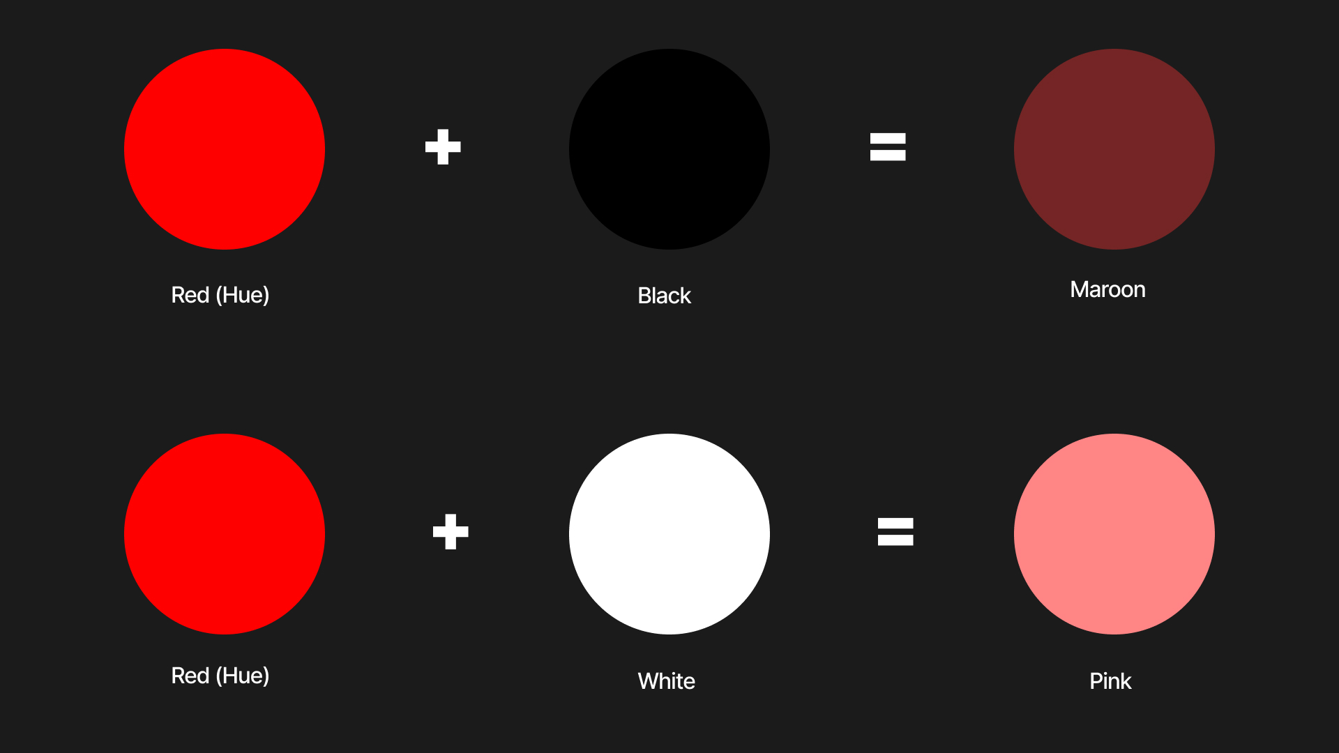
Lightness (or Value)
Lightness is how much white or black you add to a color. Red is maroon’s hue, and it has a bunch of black added to it. In contrast, pink has the same hue but is now combined with white.
Changing the lightness of a hue can dramatically change how a color feels, so be wary of how much you adjust it. Some colors that are too light can be overwhelming, creating issues with contrast and causing eye strain. This is usually the case when using bright-colored text on a white background. Always keep usability in mind when choosing your colors.
Saturation
Saturation is the potency of a hue.
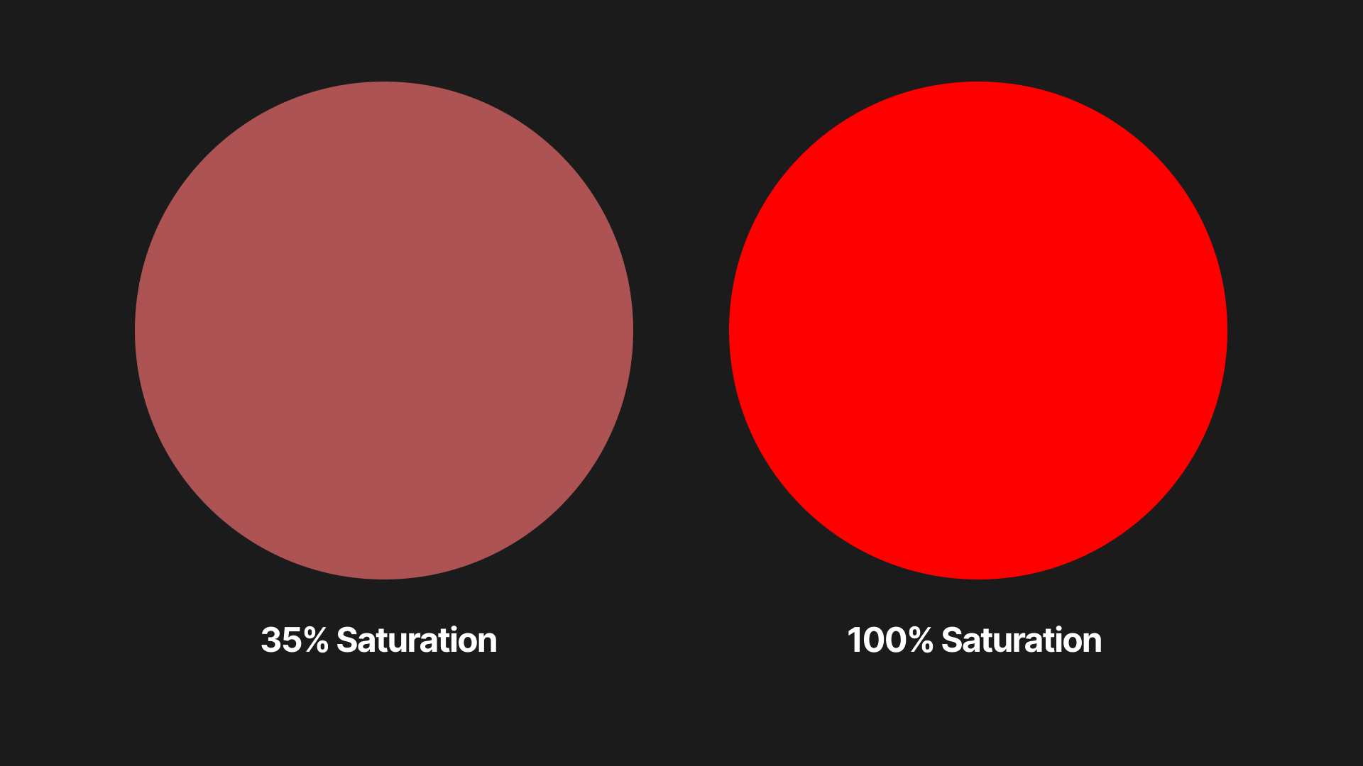
At 100% saturation, the color will be the purest form of its hue. Colors with higher saturation are usually used in elements that are focal points, as they need to attract attention.
As a color loses saturation, it will incorporate more gray to itself. Although this makes the color look dull, some desaturated colors are actually soothing to the eyes. Using a muted color palette can give your design a calming presence.
Color Models
Color models are systems that help you view colors in numerical values. There are two main types of color models: additive and subtractive.
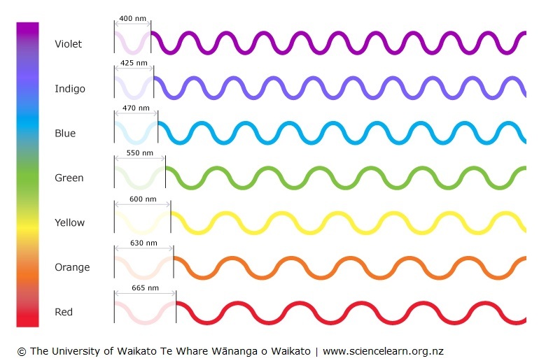
The main difference between them is how they handle the creation of new colors, specifically how they manipulate the wavelengths.
Wavelengths are simply the measure of light waves that hit your eyes when you see color. The longer wavelengths create a reddish hue and smaller wavelengths create a purple one.
Subtractive
Subtractive color models such as CMYK are mostly used in printing and painting. CMYK stands for cyan, magenta, yellow, and key (black).
It’s called subtractive because when you mix pigments like paint or ink, they subtract wavelengths from the initial pigments as they combine to create an entirely new color.
As a web designer, you will rarely use the subtractive color model as you will mostly design products displayed on screens. That’s where the other type of color model comes into play.
Additive
Computer screens, televisions, cameras, and phones use additive color models like RGB (red, green, and blue). This is the model that you will use when designing digital products.
When you create new colors using an additive color model, you combine the wavelengths of each color that you use. This means that every wavelength still reaches your eyes.
Color Schemes
Color schemes are groups of color that are visually pleasing when used together. There is an immeasurable amount of color schemes out there that you can use.
But be sure to pick the right one since a randomly chosen color scheme might not fit the message you’re design is trying to deliver.
Color Harmony
In music, several notes combined create a chord. A chord is simply all of the notes harmonizing together to create a beautiful sound. Like notes, certain colors have relationships with each other that make them harmonize, forming an aesthetically pleasing visual and conveying a unique feeling to the viewer.
These musical notes only work together because they are all from one key, this is also the case in design.
Most of the time, you have an initial color that you decide on, the ‘key color’. To create a color scheme, you first have to find out what color harmonizes with the key color.
Types of color schemes
To figure out a good color scheme for your key color, rely on tried-and-tested color harmonies that already exist.
Seven types of color schemes exist, but in this article, I will only talk about the most common types used in web design.
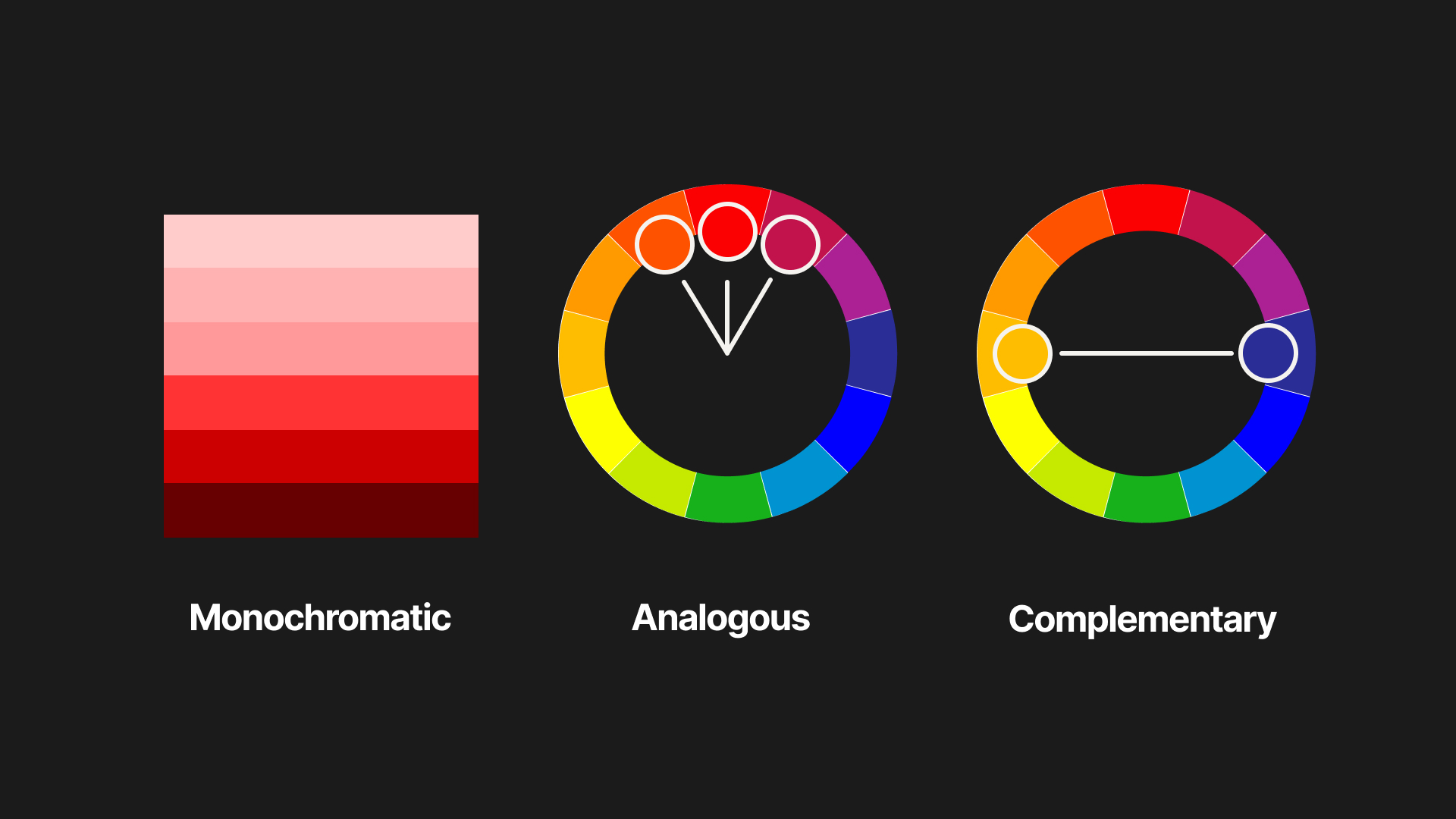
Monochromatic
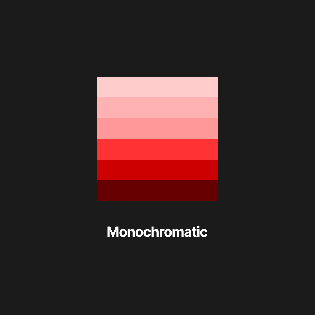
The monochromatic color scheme only uses the different variations of one hue. For example, a monochromatic color scheme with the color red will contain maroon, burgundy, pink, etc.
Many different industries use a monochromatic color scheme for their website.
- Fashion and beauty websites usually opt for this color scheme to radiate elegance and style. The minimalist look monochromatic colors offer also gives the different products they sell the spotlight, catching any potential customer’s attention.
- Some corporate and business websites use this color scheme (often with blue) to appear professional and reliable. It also makes the content of the website look more serious and authoritative.
- Many portfolio websites also take the monochromatic angle, often for the same reasons previously mentioned.
Monochromatic color schemes are easy to create, but it’s hard to pull off. When done poorly, your design can look boring and lifeless. To learn how to make good monochromatic designs, let’s look at other examples:
Flaner’s website uses green as its hue. For its background, it uses a light, desaturated variation of green and it uses a darker version for its foreground elements. This technique allows the design to have good contrast, making the content readable.
To try and make the monochromatic design more interesting, they use an animated grainy texture over the entire website. This kind of creative choice gives the website more personality and style.
On Tapwater’s website, they use a blown-up animated illustration to create more visual interest. The illustration is also monochromatic, using different shades of blue similar to the content.
You can also do this with real images. On Jones Bar-B-Q’s website, they use an image of the product containing shades of red, making it go well with the monochromatic scheme.
The use of imagery alongside content has always been very reliable in creating visual appeal, so always try and use it!
Analogous

Clerksy uses yellow, orange, and green for their website. This analogous color scheme is often seen in nature, which is why the design feels calm and safe.
Rekupe’s website also uses an analogous color scheme, using red, blue, and violet. You often see this color combination in tech websites, since it gives off an elegant and professional look.
Reech also uses the same color combination, taking advantage of gradients to give it a more textured look.
These color combinations often mix both warm (red, orange, yellow) and cool colors (blue, green, purple), but mixing colors coming from the same classification can also work!
Analogous color schemes only using cool colors give off a very professional and serious feeling, perfect for tech or corporate websites!
Using only warm colors gives off a very playful look. A much warmer and calming energy. Small businesses, non-profit organizations, or children’s websites often use this type of color combination.
Complementary

Using colors that are directly opposite each other on the color wheel gives you a complementary color scheme. One color is usually chosen as the dominant and the other one as an accent.
Unlike analogous colors, complementary color schemes have a high-contrast look. This means that you can use the other color for foreground elements without worrying too much about the readability.
Banky’s website uses a slightly dark yellow as its background, with bright blue coloring the buttons and the brand name. These blue elements are the focal points of the website, and the contrasting effect makes your eyes gravitate towards them first.
Timely’s gradient background incorporates a dark purple and some foreground elements use teal. You will notice that these websites use the accent color exclusively for specific highlighted elements.
Due to the high-contrast nature of complementary colors, there is always a danger of using the accent color too much.
If you were to use an accent color the same amount as the dominant color, it could make the design look busy and confusing. So only use your accent colors on those elements you deem to be focal points: CTA links, headlines, testimonials, etc.
Useful tools you can use
Adobe Color
If you’re trying to create your own color schemes, Adobe’s free color wheel is your best friend. You just need to input your key color and then select what kind of color scheme you want from the selection they have.
This automatically gives you a preview of what the color scheme will look like, complete with the HEX codes and RGB values!
Color Hunt
Color Hunt is a free database of color palettes submitted by other designers and artists. With filters like ‘vintage’, ‘retro’, and ‘neon’, this tool is perfect for anyone who wants to have an endless amount of inspiration.
You can also search for a single color on the website, and it gives you palette options for that certain color.
I personally use this tool a lot, since it lets you save the color schemes you like so you can get back to them later. So every time I start a new design, I just look back at my collection and select one that matches the project!
Key Takeaways:
- Color makes people feel. The emotions that get will be different for every person based on their culture, knowledge, past experiences, and also the medium or environment where they view a certain color.
- Hue acts as the ‘original version’ of a color, lightness is how much white or black you add to it, and saturation is how much gray is in it.
- Printing uses subtractive color models, while digital mediums use additive color models.
- Color schemes are groups of colors that you use in a design, color harmony is how well those colors work together.
- Monochromatic color schemes use different versions of a hue.
- Analogous color schemes use colors that are next to each other on a color wheel.
- Complementary colors use colors that are opposite each other on a color wheel.
- Adobe Color is an online color wheel tool that helps you create your own color palettes.
- Color Hunt is an online tool that provides you with a collection of pre-existing color palettes.
Conclusion and Reading Recommendations
Thank you for getting through this very long post! Now that you have learned the basics of color theory, you go out there and apply your knowledge to your next project!
Or if you want to learn more about color, check out these books:
Interaction of Color
by Josef AlbersConceived as a handbook and teaching aid for artists, instructors, and students, this timeless book presents Albers’s unique ideas of color experimentation in a way that is valuable to specialists as well as to a larger audience.
Secret Language of Color
by Joann EckstutIn this beautiful and thorough investigation, The Secret Language of Color celebrates and illuminates the countless ways in which color colors our world.