
How to use gradients effectively in your web design projects
Using gradients is an excellent way to add energy and movement to your designs. In this article, we’ll look at gradients, how to use them effectively, and how to create them in Figma and CSS.
Gradients are back in style
Like mom jeans, mullets, and polaroids, several trends that have seemingly drowned in our culture have been starting to emerge in the 21st century. UI design isn’t an exemption, creative techniques used in several design movements from the 20th century are being used in websites today.
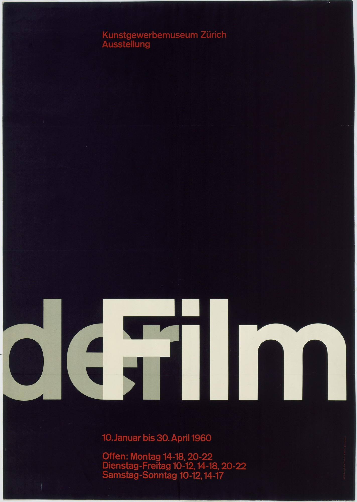
The use of huge type is heavily inspired by a lot of the posters in the Swiss design movement that happened in the 1950s until the 1980s.
Neubrutalism is weirdly based on an architectural design movement that occurred in the 1950s and lasted until the 1970s.
The most interesting trend to go back in style though, is one that didn’t go popular until after the 20th century. Gradients were big in web design back in the late 2000s, but it slowly disappeared in the 2010s when flat design grew in popularity.
Today, flat design is still very prominent but gradients are now being used in combination to provide flat elements with more energy and depth (also known as flat 2.0). Gradients don’t only provide your designs with more visual intrigue, it can also help make them accessible and user-friendly.
So how can you incorporate gradients effectively in your designs? First, you’d need to understand how they are created.
What are gradients?
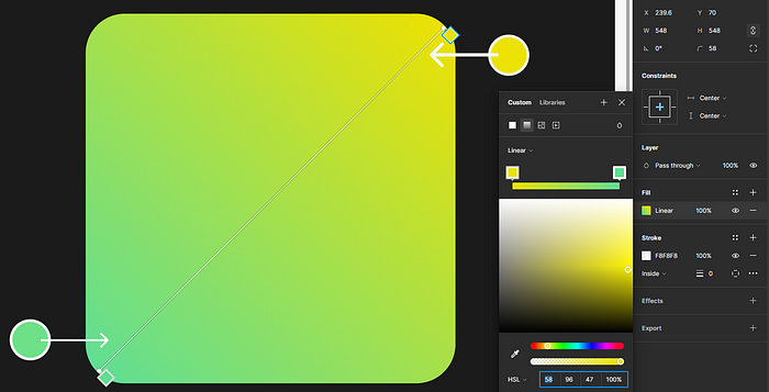
Gradients happen when one color gradually transitions into another.
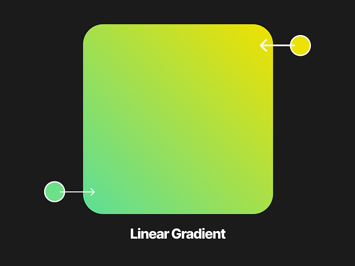
In the example above, the green on the bottom left slowly transforms into the yellow on the top right. This is also an example of a linear gradient — where the initial color and the second color are in opposite directions.

Another type is the radial gradient. This is when a color in the center, like the red in the example above, transitions outward to another color.
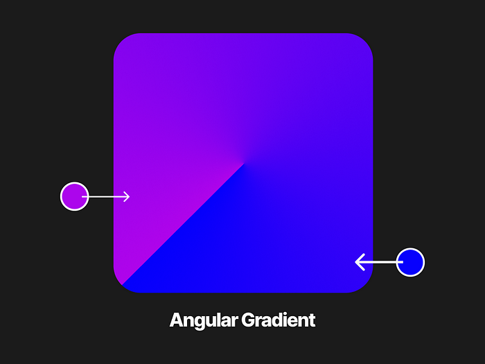
The colors in an angular gradient or a conic gradient (the term used in CSS) transition in angles rotating around the center point.
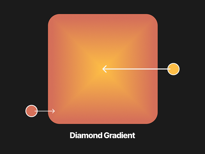
Like a radial gradient, the initial color in a diamond gradient radiates outwards. But the difference is that the color goes outward in only four directions, forming a diamond shape.
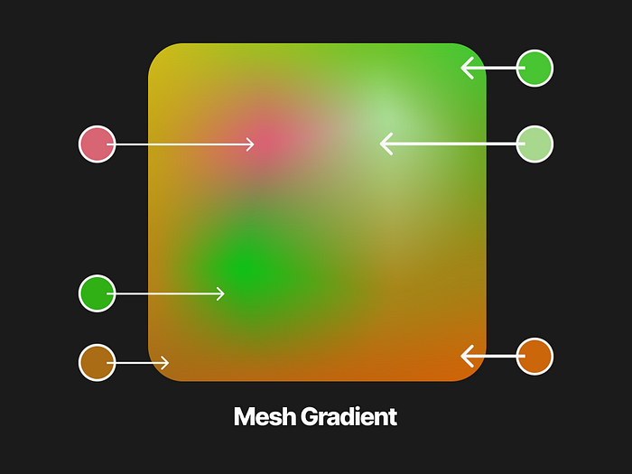
Mesh gradients are composed of several mesh points. The colors on these points gradually transition into each other. Unlike the other types, mesh gradients don’t lock your colors in a certain position. It gives you more freedom on what you want it to look like.
Now that you know the boring technical stuff, it’s time to learn how to make these beautiful gradients yourself.
Creating gradients using Figma
Creating gradients in Figma is straightforward:
- Click on an element.
- Under the fill property, click on an existing color.
- On the menu that appears, click on the gradient icon on the upper side.
- Select one of the four available gradient types (linear, radial, angular, and diamond)
- Adjust your colors!
For mesh gradients, you are going to need to use a plugin.
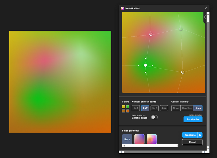
This plugin created by @gautham provides you with a simple editor where you can freely drag the mesh points around. It also gives you the option to randomize the colors when you’re feeling a little uninspired.
When you’re done creating your mesh gradient, just click generate and it will insert a shape with the gradient on your canvas.
Creating gradients using CSS
You don’t need to be a front-end genius to be able to create gradients in CSS. The syntax is not that complicated!
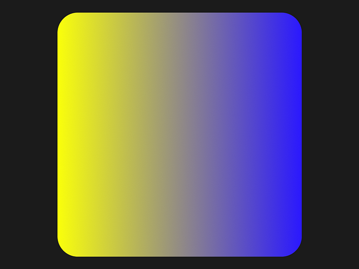
When creating linear gradients:
/_ CSS Format /
background-image: linear-gradient(angle, color-stop1, color-stop2);
/ Linear Gradient Example _/
background-image: linear-gradient(90deg, yellow, blue);
The example above will produce this gradient:
To create radial gradients and angular/conic gradients:
/_ Radial Gradients Format /
background-image: radial-gradient(shape size at position, start-color, …, last-color);
/ Angular/Conic Gradients Format_/
background-image: conic-gradient([from angle] [at position,] color [degree], color [degree], …);
Creating mesh gradients uses a combination of radial gradients to create its unique visual effect. Although this can be done manually, a tool called Mesher by CSS Hero can speed things up a lot:
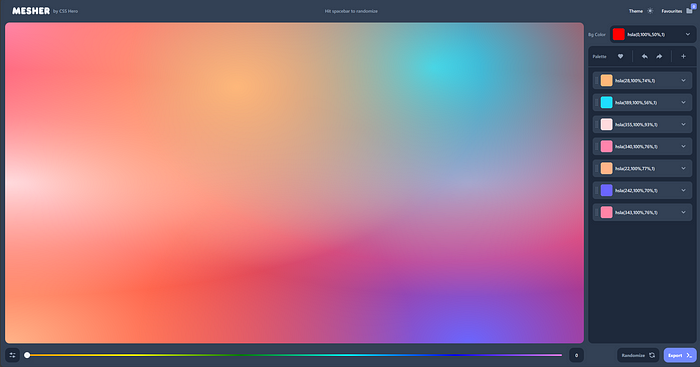
Like the previous Figma plugin, this gives you a freeform editor where you can drag all of the mesh points around. When you’re happy with your mesh gradient, you can click export on the bottom right corner and it will allow you to copy the CSS.
You now know how to create beautiful gradients!
To learn how to use the gradients you created effectively, we use the best method in learning design: observing how talented designers use it.
Using gradients in backgrounds
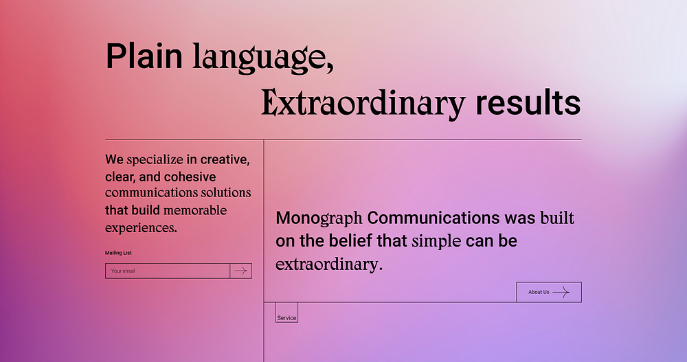
Monograph Communications’s website uses a mesh gradient with an analogous color harmony as its background. Using different variations of purple and red creates a soothing atmosphere for the website. It gives the design personality without being too distracting, shifting the user’s attention to the content.
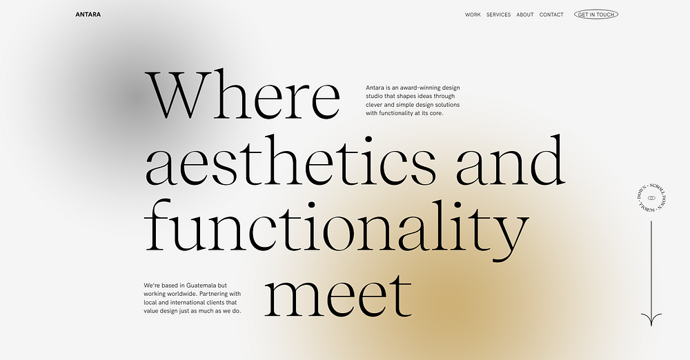
Another application of a non-distracting gradient background is on Antara Studio’s website. This is a more subtle gradient, with gray being the dominating color, transitioning into small splashes of yellow and black.
Using gradients in buttons
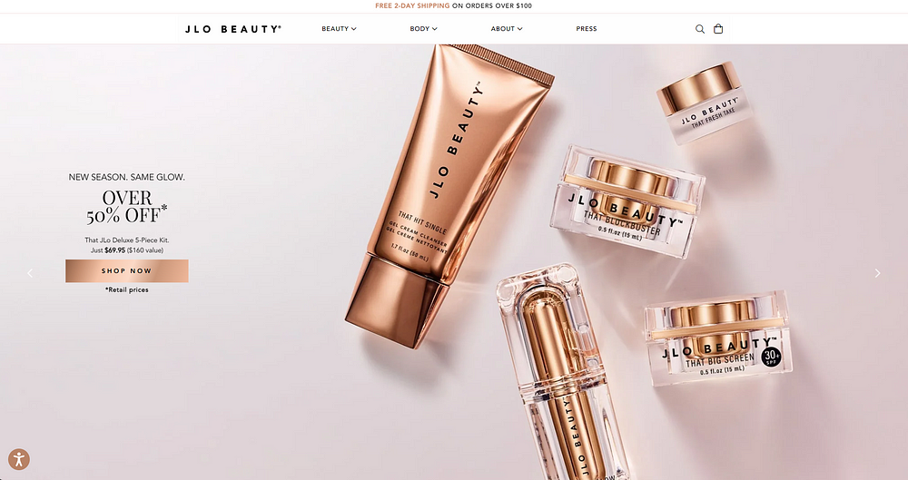
On JLo Beauty’s website, the button has a gradient that mimics the sleek packaging of the products that they sell. Not only does this promote branding consistency but it’s also a brilliant way to use gradients as focal points.
Focal points are any element that you want to shift attention to. Gradients using contrasting colors can be very eye-catching since they create a sense of movement and energy. The colors they use for the button’s gradient are monochrome, using contrasting variations of brown.
The elegant vibe that they are trying to capture is reinforced by adding an animation to the button. They create this shiny effect by moving the color stops of the gradient.
This is a good method of using gradients and motion to promote usability. But there are other ways to do this — so let’s explore other examples:
Using gradients with motion
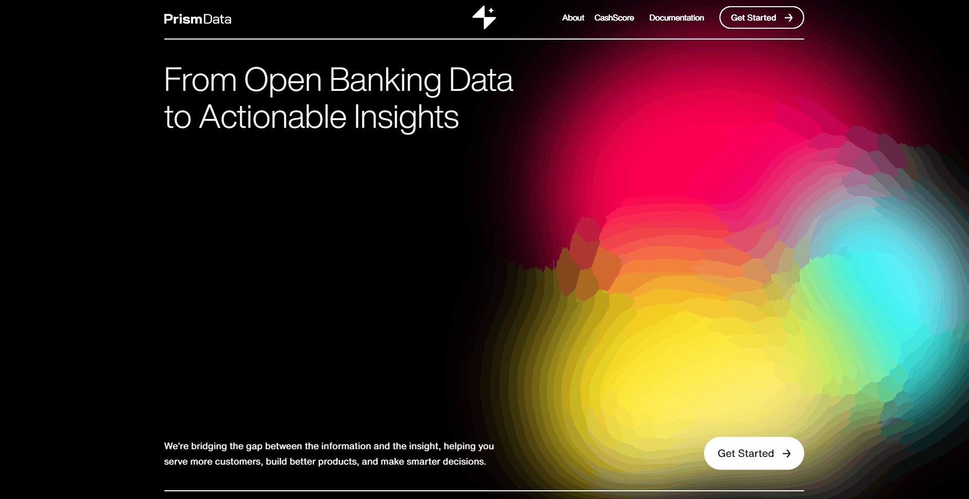
PrismData’s website has three orbs floating around on the pitch black background. Even though the design choice doesn’t offer any kind of benefit in terms of usability, it gives the website personality which is crucial in developing brand identity.
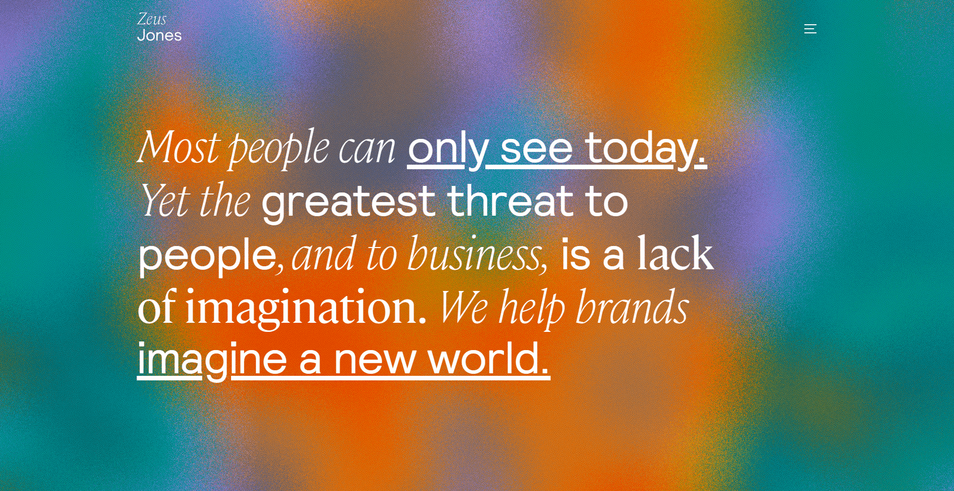
The website of Zeus Jones pushes the boundary of using gradients in web design. Like the previous example, the noisy animated background isn’t really in line with the rules of usability — but it showcases the talent of the brand and frankly, it’s just fun as hell to look at.
Using gradients in type
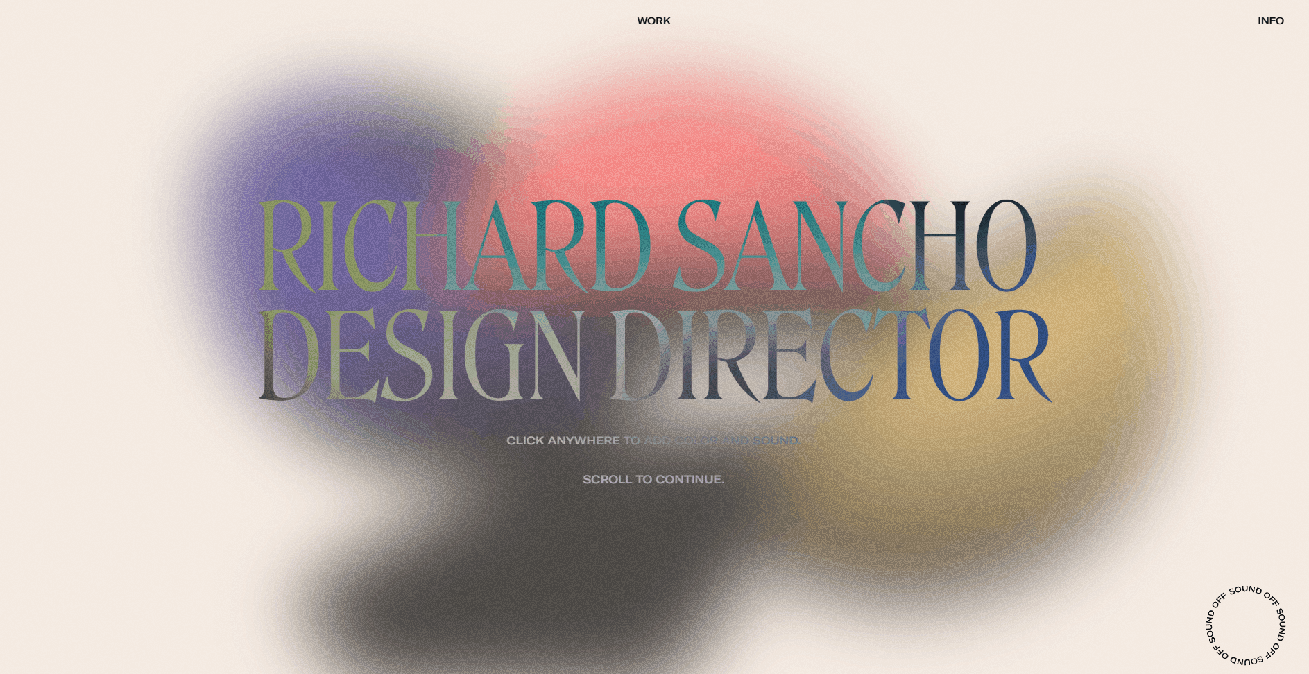
Richard Sancho’s website combines two design trends: gradients and huge type. The moving gradient in the background changes the colors in the type as well, making for a very interesting hero section. This is another example of an outlandish design decision that somehow works.
Gradients are here to stay
Anyone active in Behance or Dribbble will agree with me when I say that gradients are not going away anytime soon. With the number of people incorporating gradients one way or another in their client work and portfolios, it seems that it’s going to stick around for a while.
You don’t need to go extravagant with gradients like the websites from Richard Sancho and Zeus Jones. Using them in a more subtle way can improve your design substantially — more points if you incorporate them intending to improve your design’s usability!