
Using texture to add personality to your design
Have you ever finished a design project and said to yourself, “This looks a little boring.”
You try and figure out what you need to do to make it interesting. You start changing some colors, mixing up the layout, and changing the subtitle’s font.
In the end, it just seems that nothing is working. The design is good, but it just needs a little more oomph.
Before you abandon that design project entirely, maybe there’s a solution. Maybe you’re just forgetting about one of the seven basic elements of visual design.
Don’t forget about texture
Texture is simply how a composition feels. When designing something for a digital environment, it’s how a composition is perceived to feel.
Adding texture to your design elements not only provides them with a feeling of space and dimension, it also gives your entire design personality. Texture gives the other elements in your design like color, shape, and lines extra flavor.
Applications of texture
Using texture can create a three-dimensional effect in your designs.
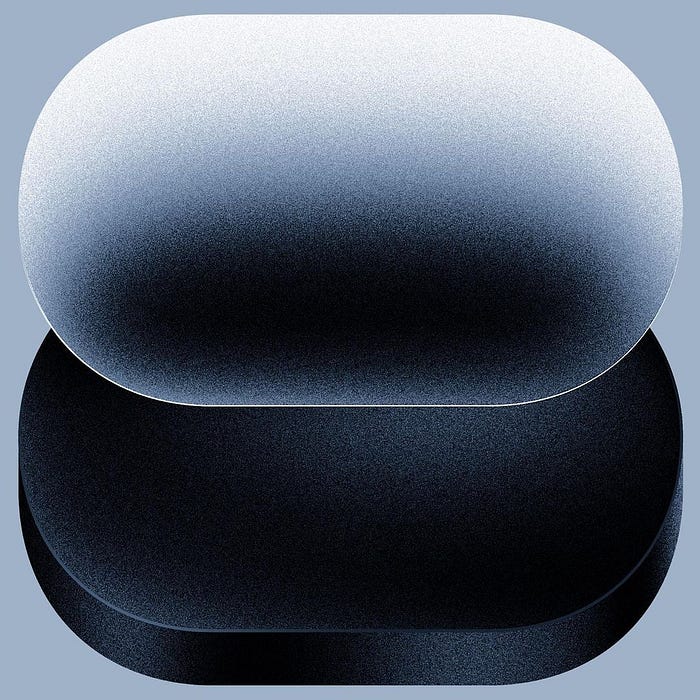
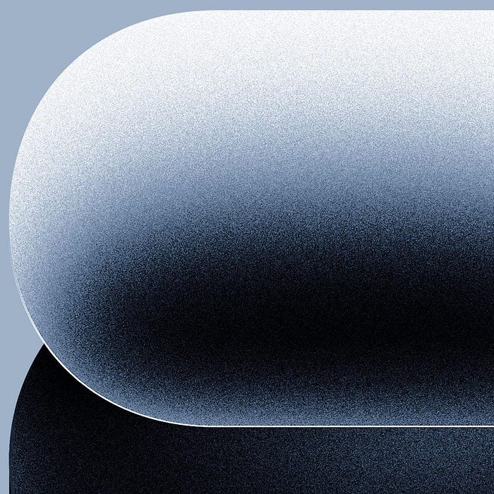
In this creative redesign of the number eight by Alec Tear, he uses a grainy texture to create dimension and space. It’s as if there were a source of light out of view on the top of the canvas, and it’s casting a shadow.
In this creative redesign of the number eight by Alec Tear, he uses a grainy texture to create dimension and space. It’s as if there were a source of light out of view on the top of the canvas, and it’s casting a shadow.
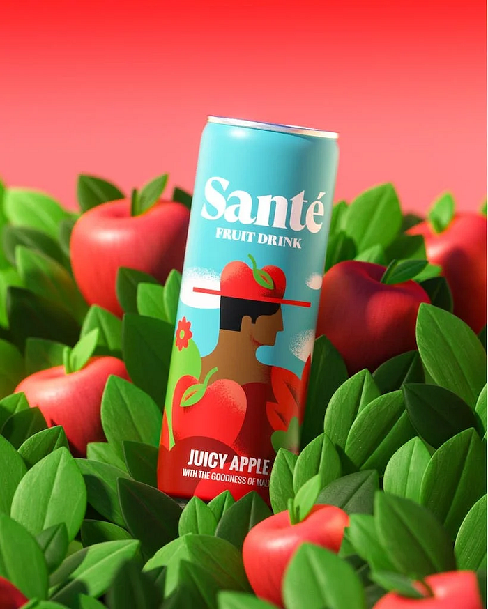
Using repetitive elements like the leaves in Santé’s product showcase above is a good way to create texture with a more realistic approach. The way they are layered and their shadows make for a very interesting background.
Elevating your design with texture
As with every design element, you can use texture not only for aesthetic purposes. You can also use it to further communicate your design’s message to the viewer.
For example:
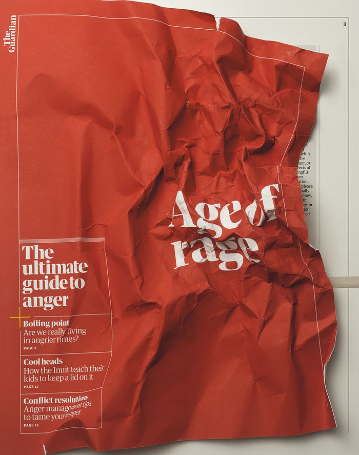
In this beautiful cover design for The Guardian, Tomato Košir reinforces the title ‘Age of Rage’ by making it look as if it was crumpled by someone angry. This is one of the most brilliant applications of texture I have ever seen.
Spending more time in your design process trying to think of ideas like this can improve your work.
Things to remember when using texture
- Don’t overdo it. Using texture too much can create visual fatigue, making it hard for anyone to look at your design.
- Make sure it fits your design. Adding a random paper overlay on a design that doesn’t need it can ruin everything. Experiment with other textures. Make sure it fits with the other elements. Figure out if your design even needs more of it.
Now go and make your designs more interesting — why not dive back into those unfinished projects and give them some cool textures?