
Designing for your user's eyes with Gestalt Theory
User-centered design demands you to think of the end user at every step of the design process. Any kind of research or design decision is to ensure that the person using the product has a good user experience.
That’s why it’s essential for designers to try to understand the user’s perspective.
What exactly happens the moment the light from the screen hits your user’s retina? How can we better understand how your user perceives your digital product?
Understanding visual perception
We live in a visual world.
We read our news to get updated, watch our movies to get entertained, and look at pictures of fat orange cats on the internet for… reasons.
Visual perception isn’t only about what we see with our eyes. When we see something, our brain processes it behind the scenes to try to make sense of whatever we were looking at. If your user is looking at a bad interface design, their brain will work harder to interpret the visual information it receives.
If you know anything about user-centered design, that is also known as adding more cognitive load to your users. That is the number one thing you have to avoid.
The brain’s ability to interpret visual information is based on multiple elements. The following are those I deem to be the most important in interface design.

- Visual memory is the ability to remember figures that we have already seen in the past. Design conventions like buttons and text forms have remained largely unchanged, except for minor aesthetic adjustments. This is because the original designs simply work and they have been in our memory for a long time. Changing a button’s design drastically can lead to a confusing time for a user.
- Visual discrimination is the ability to differentiate one shape from another. This element is pretty straightforward. Thanks to this element your users can identify which one’s a button and which one is a toggle.
These elements work hand in hand to help your user’s brain understand the visual information that your design provides.
Good designers keep these elements in mind to help create a good user experience. A bad designer’s work often ignores those elements and causes something called visual stress.
Visual stress
"Good design is actually a lot harder to notice than poor design…"— Donald A. Norman, Author of The Design of Everyday Things
A good interface design is almost always invisible. Everything feels very smooth to use and you don’t have any issues trying to find what you want. Most of the time when you are using a good design, you barely recognize it. When you see a bad interface design, however, you experience visual stress. You can’t read the content that it offers, you can’t find that button you need to use and oftentimes, the interface just looks ugly. You feel confused. You feel annoyed.
You feel visual stress.
Visual stress leads to more cognitive load for your user, making them have a harder time using your product.
So, how do you avoid visual stress?
Gestalt Theory and The Law of Prägnanz
The main idea of Gestalt theory is that the whole of anything is greater than the sum of its parts. Okay, that sounds a little confusing - so let me use a visual example.

When you first look at the IBM logo, you read it as what it looks like - ‘IBM’. But if you look at it much closer you will notice that it’s nothing more than a series of horizontal lines.
The law of Prägnanz or the law of simplicity is the essential idea behind visual perception. Humans tend to reduce the visual information they receive to the simplest form. When we see complex forms, we initially see them as a simpler whole since this makes the brain do less work and it takes the least cognitive load.
But how does this relate to interface design? How can this law help you avoid causing visual stress for your users? Well, first - you have to understand the principles!
The Four Most Important Gestalt Principles
There are many Gestalt principles that you can use to make better design decisions but I have narrowed it down to the four with the most relevance to graphic design.
It is important to remember that these principles build upon one another.
Gaining a good understanding of each of these principles will make anyone a better designer, even you!
Proximity
Elements that are closer to each other belong to the same group and any elements that are far away are a different group.
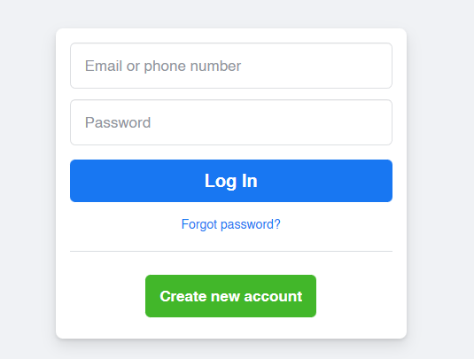
Notice how the elements about logging in are grouped together. In contrast, the one element that’s concerned with creating a new account is all the way at the bottom of the container.
By simply using the law of proximity, the design helps reinforce the purpose of these elements visually.
With a bad design, a bunch of links in a single container can turn into a disaster really quickly. Grouping the related links together organizes the content. It helps the user understand where their eyes are going to go and which element they want to interact with.
The principle of proximity works best if you understand what your digital product is trying to achieve. Grouping elements that don’t have any relationship with each other will cause a busy, cluttered mess.
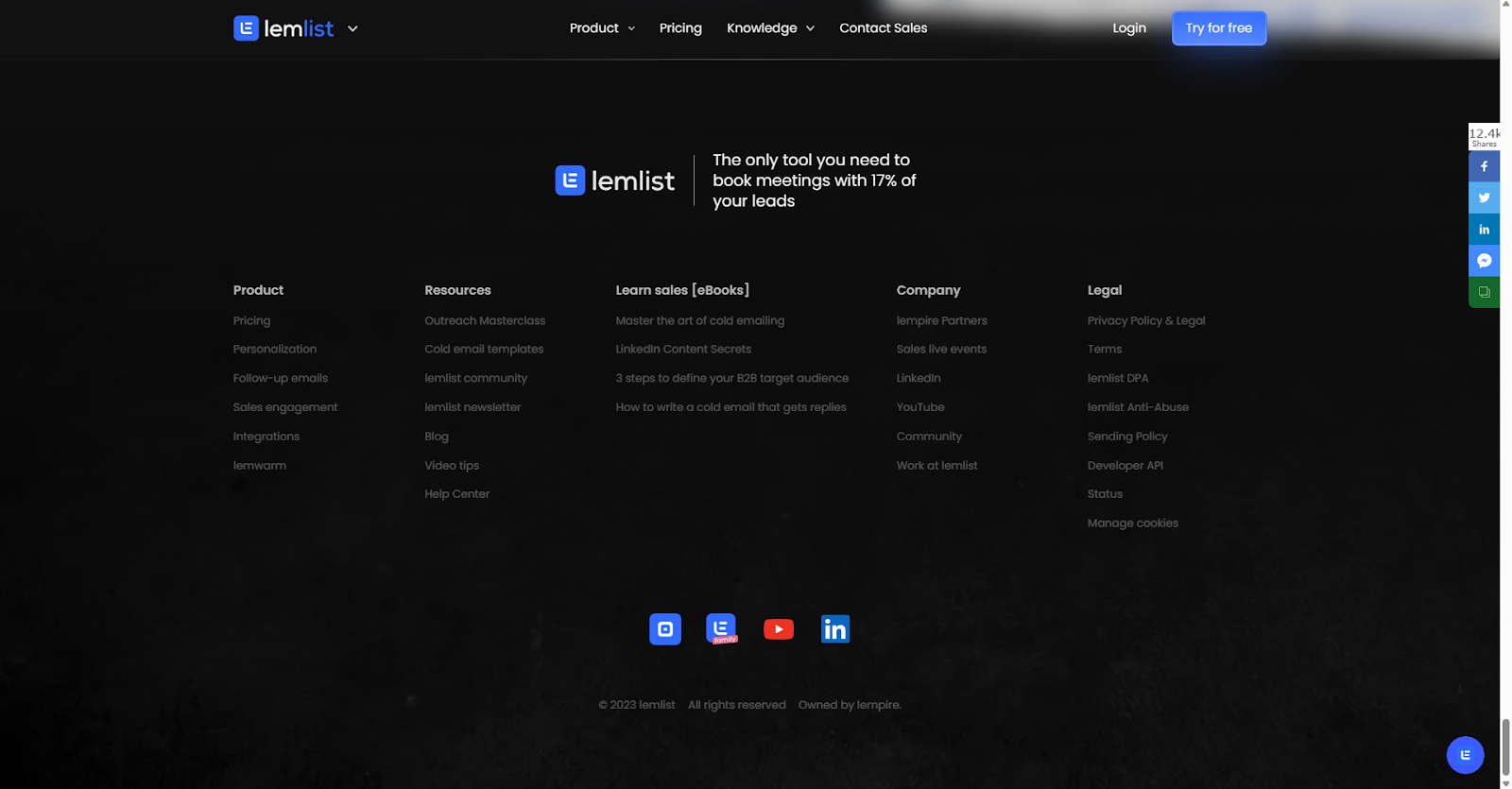
Similarity
Any elements that look alike are of the same group and have the same functionality.
This principle is almost always used in navigation bars.

Looking at the example above, some elements in the navbar have the same font color and font size. Our brain automatically identifies those elements as one group. At the same time, it also communicates to the user that each one of these elements is the same thing, in this case, they are links.
Going back to the Facebook login page, the textboxes have the same design. The text and the outline are gray, the alignment is on the left, and it has a light font and a white background.
On the other hand, the text for the buttons is white and centered, the font has a slightly higher font-weight and it has a colored background.
We instantly identify that these elements have entirely different functionalities.
Common Region
Elements in the same container are perceived as one whole group. This one builds upon the previous principle of proximity.

E-commerce websites often have a lot of information that they have to fit on one whole page. For that reason, they have to cleverly group all of those elements that relate to each other.
Each item is closed out with a subtle gray border, making every item separate from each other.
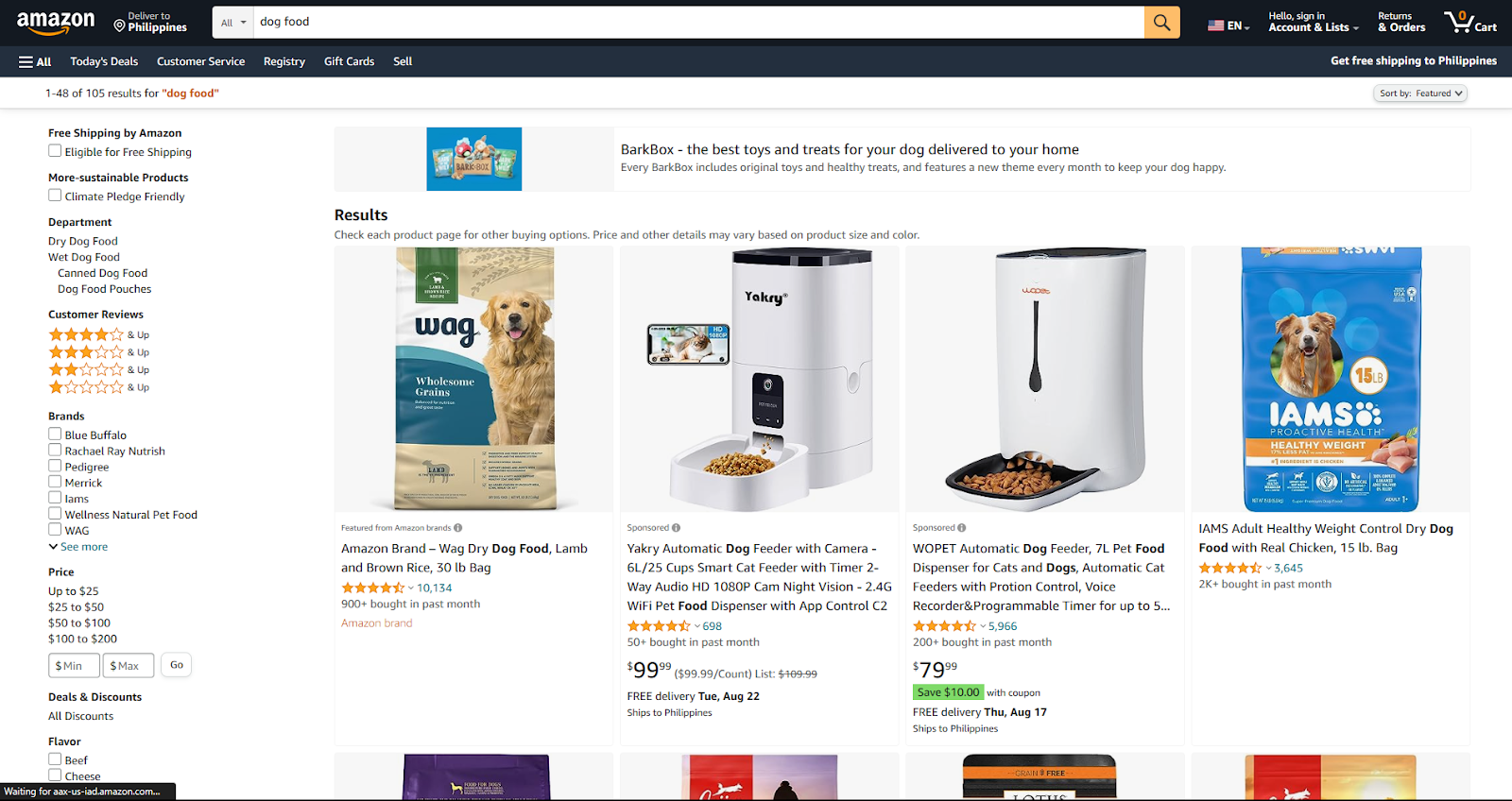
What’s interesting is that it also creates an illusion of a border for the entire results section. Grouping every item and separating it from the other elements of the page.
Focal Points
Making one element drastically different from all the other elements in a design makes it stand out more.
This principle works well when it’s applied to something that is a point of interest. Making an unimportant element a focal point can be very confusing for a user and will lead to an annoying user experience.
Landing pages use focal points a lot.
If you don’t know what a landing page is, it’s a website with one primary goal: to generate a lead or to make a sale.
The nature of landing pages makes them a really good example of focal points. Most landing pages have a button that says stuff like ‘Start Your Free Trial’ or ‘Buy Now’ and these buttons are almost always the focal point.
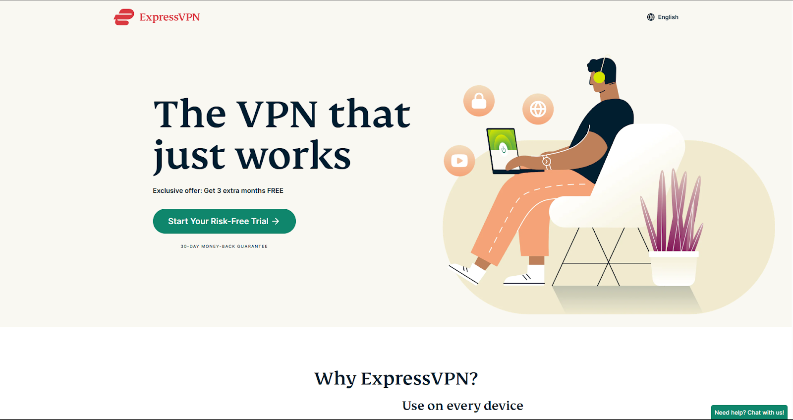
After seeing the image above, where did your eyes first gravitate towards? The ‘Start Your Risk-Free Trial’ button, right?
Focal points that are well-designed will have no problem capturing the user’s attention instantly.
Buttons used as focal points usually have a much bigger size than the other buttons on a page. They also usually have an exclusive background color.
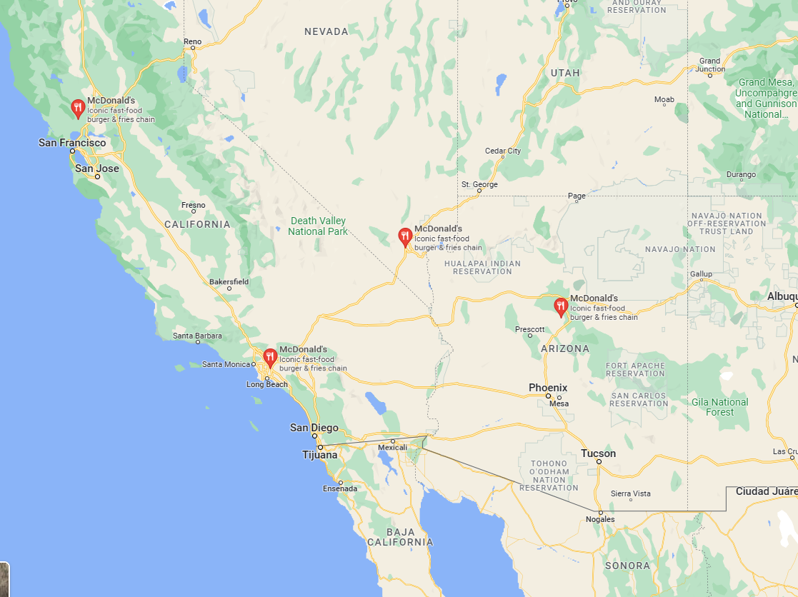
Searching for anything in Google Maps will pinpoint all the results on the interface. To make sure that the user spends no extra time trying to locate the results, they use the color red for the pins. Other than the fact that red is a very eye-catching color, it also contrasts with the yellow and green-dominated map.
Conclusion
Designing a good user experience can be very hard. A lot of issues can arise from not knowing what to expect in a user’s reception of your digital product. Now that you know visual perception, it will help you understand you’re user’s psychology better.
Each time you’re in the middle of the design process, always think about how easy or hard it is for a user’s brain to process what they are looking at. Use the Gestalt principles to guide your design choices but also keep in mind your design’s purpose and intention. It will make your designs a thousand times better.
Now get out there and use all that you have learned in this article and make some awesome designs!